Power, Ethics, and Intention in Portrait Photography
Even while on holiday, I couldn’t let this Sunday pass without addressing one of the most discussed photographic projects of recent years: Christopher Anderson’s portraits of senior members of the Trump administration during its first year in office.
As a portrait and personal brand photographer, what interests me most is not who is photographed, but how they are photographed, and what that visual language communicates. This body of work is a clear example of how photography can shape perception, whether the photographer publicly acknowledges that intent or not.
Anderson has denied malicious intention. But intention in photography does not live in statements; it lives in choices. And choices always speak.

Photography Is Visual Language, Not Documentation
Photography is not about recording faces. It is about constructing meaning.
When someone commissions a photographer, they are not asking for images; they are trusting someone to represent them visually to the world. This applies to individuals, professionals, corporations, and political figures alike. Even if the viewer cannot articulate why an image feels unsettling or powerful, the message is absorbed instinctively.
This is something many people, and even some photographers, still underestimate.
How Visual Decisions Shape Perception
There is no such thing as a neutral portrait.
Camera height, distance, framing, posture, wardrobe, and lighting all influence how a subject is perceived. Strength or fragility. Authority or insecurity. Confidence or discomfort. These messages are embedded in the image long before the viewer begins to analyse it.
This is why portrait photography carries responsibility.
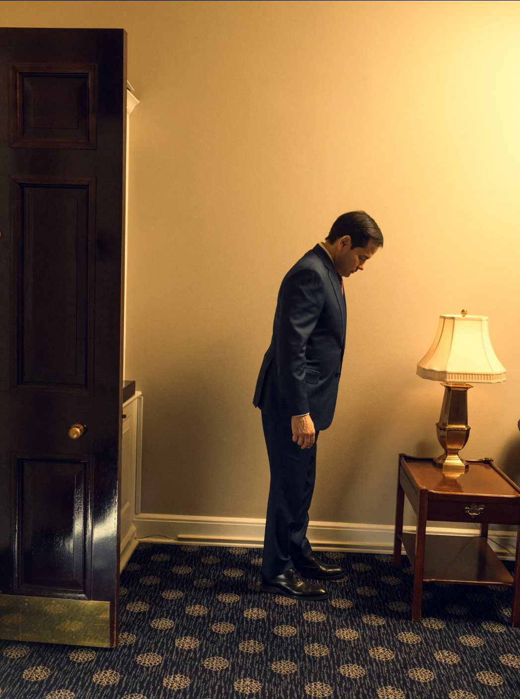
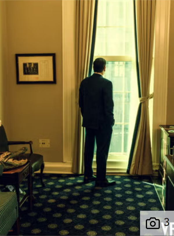
Power and Displacement: The Marco Rubio Portraits
When the photographer chose to portray Marco Rubio as shown in the images below, especially as a well-experienced professional, it was not by accident. Capturing Rubio in a large room with a weak and unstable body position was an intentional compositional choice. This composition makes Rubio appear small and not grounded. The composition also gives us the impression of someone experiencing even a moral dilemma, and who appears uncomfortable and awkward in the White House.
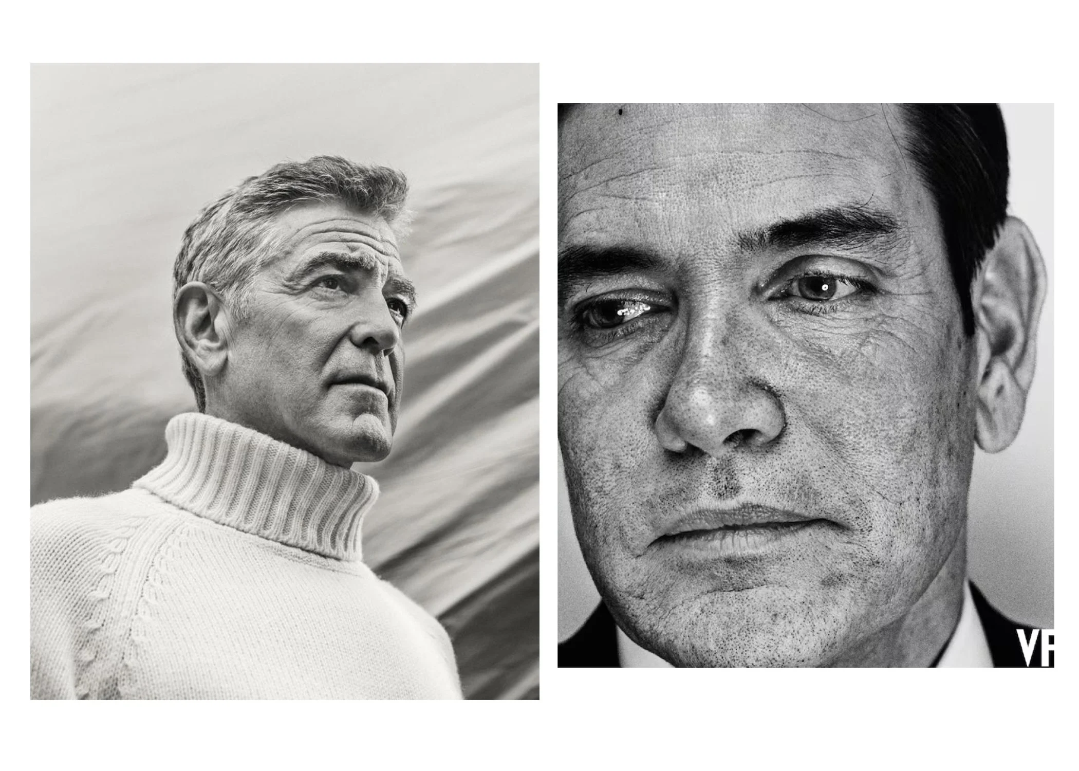
Authority by Contrast: George Clooney
When photographing George Clooney, the visual language changes completely. Anderson lowers the camera angle and strengthens the framing, making Clooney appear larger than the viewer.
This single decision communicates admiration, authority, and confidence. The contrast between these portraits demonstrates how power can be assigned or removed purely through visual strategy.
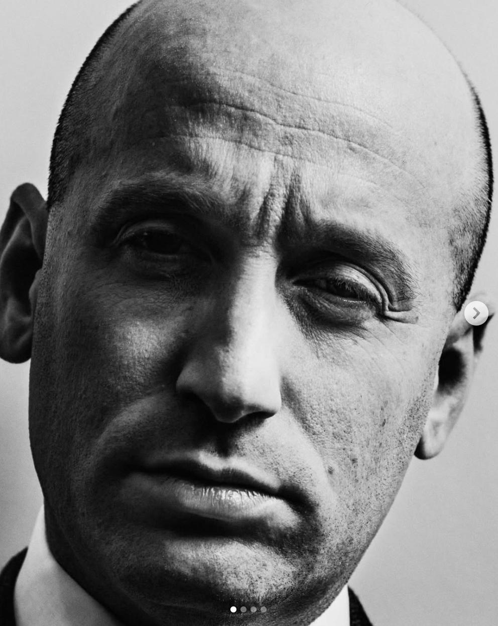
Symbolism in the Details: Dan Scavino
One of the most striking examples of intentional visual messaging appears in the portrait of White House Deputy Chief of Staff Dan Scavino. The framing draws direct attention to his haircut, a sharp, severe style that unmistakably evokes a Nazi aesthetic.
This is not subtle. It is visually obvious.
This is where Anderson’s sharp eye becomes most evident, and most controversial.

Trust and the Photographer’s Responsibility
In my own work, I consciously choose flattering angles and respectful lighting. Not to idealise, but to honour the trust placed in me. Every subject gives something valuable to a photographer: vulnerability.
Crossing the line is an ethical decision. And this is where this project becomes problematic.
The Close-Up Portraits: Where Intent Becomes Impossible to Ignore
The most controversial images from this series are the extreme close-up portraits. Anderson explained this approach to The Independent:
“Very close-up portraiture has been a fixture in a lot of my work over the years,”.
Style alone, however, does not explain outcome.
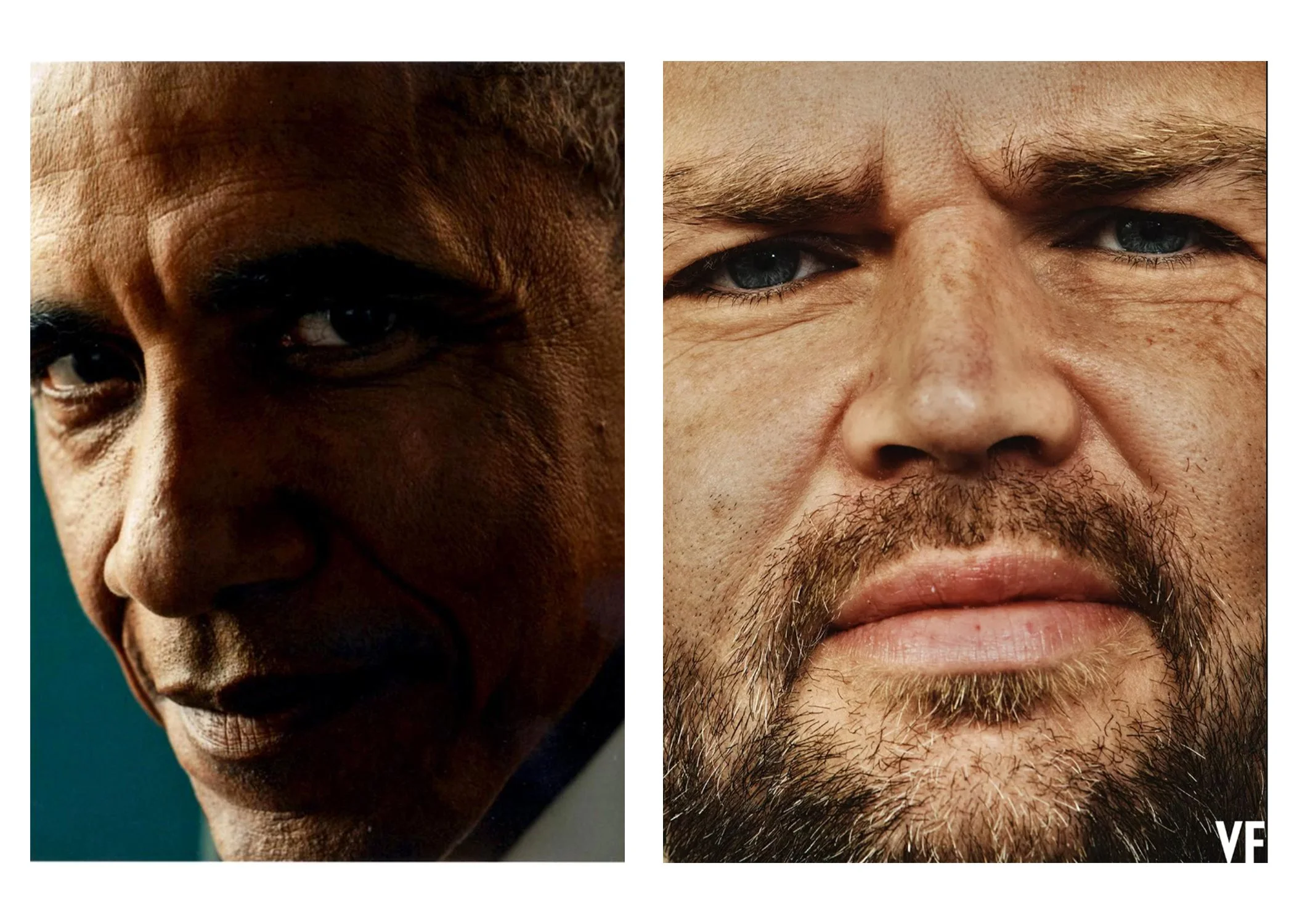
When viewing the portrait of Stephen Miller, the immediate visual association for me is Josef Mengele. This is not a literal comparison, nor a historical equivalence. The association comes from the visual language: the cold, clinical lighting, the extreme proximity, the lack of warmth, and the emotional detachment conveyed by the image.
These visual signs are deeply embedded in our collective memory. They are often used to suggest authoritarianism, fanaticism, and moral coldness. That association is created by design, not coincidence.
The lighting choice splits the face in two, a classic technique used to suggest duality or inner conflict, similar of characters such as Dr Jekyll and Mr Hyde. This visual decision reinforces the perception of a divided personality.
It is telling that Miller himself sensed something was wrong, according to Anderson’s own words to The Independent:
“When we were finished, [Miller] came up to me and he said, ‘You know you have a lot of power in the discretion you use to be kind to someone in your photographs,’” Anderson said.
“And I look at him and I said, ‘You know, you do too.’”
“I don’t know how much he related to that,” Anderson added.
These words reveal the photographer’s full awareness of his power, and the fact that it had already been exercised.
Style Is Not the Issue, Choice Is
Close-up portraiture is not inherently unflattering. The issue here is not style, but aesthetic choice.
This becomes clear when comparing Anderson’s portraits of figures such as Barack Obama and J.D. Vance. The treatment shifts. The tone changes. The visual respect varies.
Photographers always have a margin of choice. That margin is where intention live.
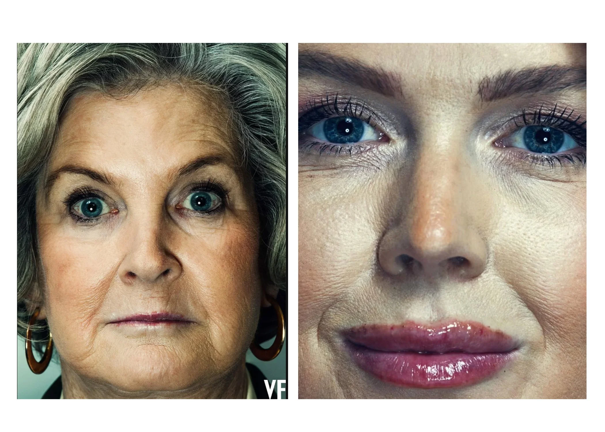
Lighting as a Political Statement
The same principle applies to the portraits of Susie Wiles and Karoline Leavitt. As portrait photographers, we know that diffused light is generally more flattering and forgiving, especially in close-up work. Hard frontal or semi-frontal light, combined with high-resolution cameras, exaggerates every skin detail and texture.
Anderson is a highly experienced professional. He knows exactly what this lighting produces.
These images were not careless. They were precise.
Own the Intent
This photographic series functions as a political statement. As a visual document of its time, it is powerful and historically relevant. Artistically, it is fascinating.
But professionalism also requires accountability.
The images were intentional.
The framing was intentional.
The editing was intentional.
The publication was intentional.
And that is acceptable, as long as it is owned.
If controversy is the goal, responsibility must follow. Own your shadow…but truly own it.
If you found this blog post interesting also you might like my analysis of Donal Trump presidential portrait.
Book your free consultation today and discover how professional photos can elevate your brand.
Follow me in Instagram. Connect with me in LinkedIn.
Thank you for reading.
Bye for now.